Styling Storefront App Blocks
The storefront blocks come with settings to make it easier to have them look and feel like the rest of the eCommerce store. Most styling on the blocks can be done through CSS and element attributes on the blocks.
Fitting the blocks on the page
Each block will respond to it's parents width and fit within it. It is recommended that each block takes up most of the horizontal content on the page. In other words, spans the full width or only shares width with a sidebar/navigation bar. Each block expects to scroll vertically with the rest of the document (the main scroll area) and not have its own vertical overflow.
How CSS and styling is applied to the blocks
Each block is implemented as a custom web component inside of its own shadow DOM. All style rules within the block components will not bleed into the rest of the page or other components. Also, the components will not have access to any CSS rules outside of the component except for inherited rules:
- CSS custom properties
- font-size
- font-family
- font-*
- background
- color
- line-height
Pitfalls:
The component does not inherit CSS rules like:
h2,
.header {
  font-size: 12px;
}

<ambassador-feed-block></ambassador-feed-block>
This will not style every h2 inside <ambassador-feed-block>, or anything with class header in the blocks.
h2,
.header {
  font-size: 12px;
}

<div class="header">
  <ambassador-feed-block></ambassador-feed-block>
</div>
This will style all normal text in <ambassador-feed-block> to 12px, but not h2 headers.
Ways to customize the blocks
Inherited Styles
Any parent to the blocks should set a font-family, font-size, and color the blocks will use for defaults. We recommend just using the website's defaults for these.
<body>
  <style>
    body {
      font-size: 16px;
      font-family: "Comic Sans";
      color: grey;
    }
  </style>

  <div>
    <ambassador-hero-block></ambassador-hero-block>
  </div>
</body>
Use CSS custom properties and attributes
The storefront can be customized through custom properties and attributes to match your brand's looks and feel.
Base Styles
These base attributes will apply across all components to apply consistent stylings throughout the storefront.
<style>
    :root {
        /* primary brand color */
        --lc-primary-color: revert;

        /* background color for storefront & modals */
        --lc-primary-background-color: revert;

        /* background color of storefront navbar */
        --lc-navbar-background-color: revert;

        /* font colors */
        --lc-font-primary-color: revert;
        --lc-font-secondary-color: revert;

        /* base font size */
        --lc-font-size: 1rem;
    }
</style>
Below are additional custom properties and attributes that can be applied to each block. All settings are optional.
Ambassador Hero Block
<style>
    ambassador-hero-block {
       /**
        * HERO BLOCK GENERAL PROPERTIES
        **/

        /* controls the background for the hero banner*/
        --banner-background: no-repeat center cover #ffffff;

        /* controls font size for ambassador's name */
        --lc-fullname-font-size: 1.75rem;

        /* controls font weight for ambassador's name */
        --lc-fullname-font-weight: revert; /* default browser h2 weight */

        /* controls font color for ambassador's description */
        --lc-hero-description-color: revert;

        /* controls font size for bio text */
        --lc-bio-font-size: 1.5rem;

        /* controls font weight for bio text */
        --lc-bio-font-weight: 300;

        /* controls background color for the top right corner button */
         --creator-btn-background-color: #001021;

         /* controls font color for the top right corner button */
         --creator-btn-color: white;

         /* controls padding for the top right corner button */
         --creator-btn-padding: 8px 15px;

         /* controls the avatar size for the hero */
         --lc-hero-avatar-size: 64px;

         /* controls the line height for the text in the hero */
         --lc-hero-line-height: 1.22;

         /* controls the font size for the hero text */
         --lc-hero-font-size: 1rem;

        /* controls the letter spacing for the hero block */
        --lc-hero-letter-spacing: 1.5rem;


        /**
         * HERO BLOCK UPDATE CUSTOM PROFILE IMAGE PROPERTIES
         **/

         /* controls the size of the camera icon */
         --lc-camera-icon-size: 0.75rem;

         /* controls the color of the camera icon */
         --lc-camera-icon-color: #23395b;

         /* controls the background color of the camera icon */
         --lc-camera-icon-background-color: #ffffff;

         /* controls font size for the hero editor modal */
         --lc-hero-editor-modal-font-size: 1rem;

         /* controls font size for the buttons in the editor */
         --lc-hero-editor-btn-font-size: 1rem;

         /* controls border color for the update button in the editor */
         --lc-hero-update-btn-border-color: #23395b;

         /* controls background color for "done" button in the editor */
         --lc-hero-done-btn-background-color: #23395b;

         /* controls font size for social posts in the hero section */
         --lc-hero-social-posts-font-size: 1rem;

         /* controls background color for badges in the hero section */
         --lc-hero-badge-background-color: #444;

         /* controls the font size for the image cropper */
         --lc-image-cropper-font-size: 1rem;

         /* controls the color of the image cropper slider */
         --lc-image-cropper-slider-color: #23395b;

         /* controls the background color of the image cropper slider */
         --lc-image-cropper-slider-background: rgba(18, 18, 18, 0.7);
    }
    </style>

    <ambassador-hero-block
        share-button-text="text inside the 'share' button, default 'Share'"
        share-button-copy-message="text inside the 'share' tooltip, default null">
    </ambassador-hero-block>
Use the following CSS rules to customize button styles for bio sections within the ambassador-hero-block component.
/* For the cancel button */

ambassador-hero-block::part(cancel-bio) {
  --btn-color: #ffffff;
  --btn-background-color: #0f172a;
  --btn-font-size: 1rem;
}

/* For the save button */

ambassador-hero-block::part(save-bio) {
  --btn-color: #ffffff;
  --btn-background-color: #0f172a;
  --btn-border-radius: 8px;
}
Refined Display
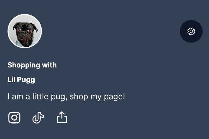
The ambassador hero block defaults to the "condensed" view on mobile devices:
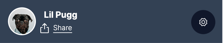
To provide visitors with additional information about the ambassador, similar to the desktop view, enable the collapsed view by adding the collapsed attribute to the ambassador-hero-block HTML tag:
<ambassador-hero-block collapsed></ambassador-hero-block>Upon implementation, the UI transforms to this:
Banner Background Image
One modification commonly made to the hero block is placing an image instead of a solid color as the banner background. This is easily accomplished by setting the CSS to use a relative image from your website.
--banner-background: url(/relative-path/to/image.jpg) no-repeat center center / cover; For optimal display, it's recommended to use a banner background image with an aspect ratio of 19:5 and a minimum width of 1400px. This aspect ratio ensures the image will look good across different screen sizes and resolutions.
Ambassador Feed Block
<style>
  ambassador-feed-block {
    /* button properties (shows when ambassador is editing their storefront) */
    --lc-btn-height-lg: 44px;
    --lc-btn-height-md: 36px;
    --lc-btn-height-sm: 28px;
    --lc-btn-border-width: 1.5px;

    /* collection header properties */
    --lc-collection-featured-font-size: 1rem;
    --lc-collection-header-font-size: 20px;
    --lc-collection-product-count-font-size: 14px;
    --lc-collection-description-font-size: 16px;

    /* navbar properties */
    --lc-collection-navbar-font-size: 1rem;

    /* product card properties */
    --card-border-radius: 10px;
    --product-card-background-opacity: 0;
    --product-details-color: revert;
    --product-title-font-size: 1rem;
    --product-title-font-weight: revert;
    --price-font-size: 1rem;
    --price-color: revert;
    --price-font-weight: revert;
    --price-discounted-color: revert;
    --price-discounted-font-weight: 500;
    --price-promotional-color: revert;
    --price-promotional-font-weight: 500;
    --price-promotional-font-size: 1rem;

    /* promotional price detail text: with code CODE */
    --price-promotional-details-font-weight: 500;
    --price-promotional-details-font-size: 0.8rem;
    // to change "CODE" text weight only
    --price-promotional-code-font-weight: 500;

    /* notification properties */
    --lc-nudge-background: revert;
    --lc-nudge-color: revert;

    /* feed properties */
    --loudcrowd-infinite-feed-margin: 0px;

    /* background color of action buttons */
    --lc-action-nav-btn: revert;
  }
</style>

<ambassador-feed-block></ambassador-feed-block>
Navbar customizations
The navbar will be styled based on the styles you set in your :root; however, if you want to style the navbar specifically, you can target that component using the exported parts.
ambassador-feed-block::part(loudcrowd-navbar) {
  /* navbar background color */
  --lc-navbar-background-color: revert;

  /* navbar font color */
  --lc-font-secondary-color: revert;

  /* navbar active tile background color */
  --lc-primary-background-color: revert;

  /* navbar active tile font color */
  --lc-font-primary-color: revert;
}
Ambassador Feed Header customizations
You can also target specific components within the ambassador feed collection header.
/* Customize the Featured label in the collection header */
ambassador-feed-block::part(featured) {
  /* color of the star icon and text */
  --lc-primary-color: revert;

  /* any standard CSS properties */
}

/* Customize the product count label in the collection header */
ambassador-feed-block::part(product-count) {
  /* any standard CSS properties */
}

/* Customize the collection name in the collection header */
ambassador-feed-block::part(collection-name) {
  /* any standard CSS properties */
}

/* Customize the collection description in the collection header */
ambassador-feed-block::part(collection-description) {
  /* any standard CSS properties */
}

/* Customize the action buttons in the collection header */
ambassador-feed-block::part(lc-mc-action-nav) {
  /* background color of buttons */
  --lc-action-nav-btn: revert;

  /* icon colors */
  color: revert;

  --btn-border-radius: 10px;
  --btn-border-color: revert;
  --btn-border-width: 20px;

  /* any standard CSS properties */
}
Ambassador Feed Action Buttons
By default, the ambassador feed block provides floating ambassador action buttons (add, edit, share) that stick to the bottom of the screen. However, by providing the optional parameter shown below, the feed will use non-sticky buttons that are placed at the top of the feed.
<ambassador-feed-block use-inline-actions></ambassador-feed-block>By default, the ambassador feed block displays only the product name in the feed item list. However, by adding the optional parameter shown below, the feed will include the brand name before the product name in each item.
<ambassador-feed-block show-brands></ambassador-feed-block>This attribute provides additional context by displaying the brand along with the product name.
To customize the action buttons, modifications can be made through parts exported to the ambassador block. Here's how you can achieve this:
ambassador-feed-block::part(lc-mc-action) {
  --btn-background-color: transparent;
  --lc-primary-color: #0F172A;
}
Ambassador Featured Product Block
<style>
  ambassador-featured-product-block {
    /* product title font size */
    --lc-fp-product-title-font-size: 2rem;
    /* product price font size */
    --lc-fp-product-price-font-size: 1.5rem;
    /* featured by tag font size */
    --lc-fp-featured-by-font-size: 1.5rem;

    /* button height */
    --lc-fp-btn-height: 2.5rem;
    /* button background color */
    --lc-primary-color: revert;
    /* button font color */
    --lc-fp-btn-font-color: revert;
    /* button border radius */
    --lc-fp-btn-border-radius: 0;
    /* button font size */
    --lc-fp-btn-font-size: 1.2rem;
  }
</style>

<ambassador-featured-product-block></ambassador-featured-product-block>